APAP
Rework All People All Places Website Structure
Information Architecture | UX Design

Reframing Compassion: A UX Refresh for All People All Places
Making it easier for people to find help — and for helpers to make a difference.
[Overview]
All People All Places is a North London charity supporting people experiencing homelessness. When reviewing their existing website, it was clear that the structure and messaging weren’t quite reflecting the heart of their mission. Pages overlapped, calls to action competed rather than complemented each other, and vital services like the Night Shelter were hidden away.
The goal of this project was to restructure the site in a way that felt human-first, not donor-first — putting help and support at the centre while still making fundraising and volunteering more purposeful and engaging.
[Project]
The Challenge
The original site had a few core usability issues:
Duplicate content: “Stories” and “Campaigns” were effectively the same thing.
Confusing hierarchy: “Get involved” treated signing up to a newsletter the same as fundraising or volunteering.
Unclear messaging: “£100 could provide food and travel…” left users unsure whether their contribution would actually help.
Inconsistent content: “About Us” mentioned the day centre but not the night shelter featured on the home page.
Calls to action competed: No clear prioritisation between “Get Help”, “Donate”, or “Volunteer”.
Overall, the site lacked a clear journey — both for those seeking help and those wanting to give it.
The Approach
I began by auditing the current navigation, content, and messaging across all pages. I then mapped user needs into two primary journeys:
Those needing help — accessing support services easily and quickly.
Those wanting to help — through volunteering, donating, or fundraising.
The new structure aimed to simplify, humanise, and inspire action. I prioritised clarity and logical grouping, creating a sitemap that balanced empathy with engagement.
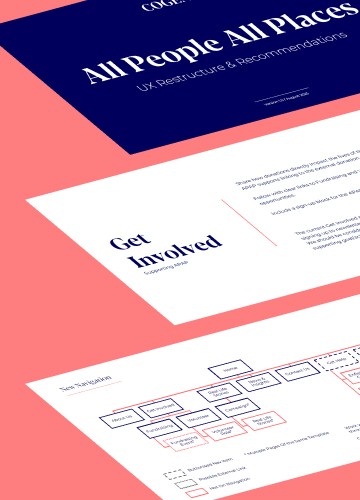
The Solution: New Site Map & Content Direction
New Navigation
Get Help was elevated as the primary call-to-action, visually styled as the main button. Donate became the secondary — reinforcing caring comes first.Footer Enhancements
A reorganised footer now includes clear quick links (Day Centre, Night Shelter, Donate, Work With Us, etc.), charity details, and a distinct newsletter block for better visibility without stealing focus from core actions.Page-by-Page Direction
Each key page received a clear UX rationale and content guidance
[Industry]
Charity
[My Role]
UX Designer
Information Architect
[Platforms]
Web
[Process]
[Outcomes]